claire fletcher: stepping back in time


This is probably the first Claire Fletcher painting I ran into several years ago and I’ve been in love with her work ever since.

As usual, I was probably searching for bears and this piece caught my eye because it contains a real bear as well as a teddy. There was much “ooohing and ahhhhhing” in the Alphabet Soup kitchen, so naturally I had to find out more.

Here’s a picture of Claire. Don’t you love her braids?


She lives in Hastings, a seaside town/fishing port on the southern coast of England. It looks like she collects vintage toys and ephemera. My kind of person!

This is the bio from her website:


Whether it’s her acrylic or watercolor paintings, illustration work, or pen-and-ink drawings, I like them all.


Continue reading

dee nickerson’s lovely world


I like imagining the little stories depicted in Dee Nickerson’s paintings. These ladies seem so content sitting outdoors with their warm beverages, newspaper, knitting, and kitties. And look at those wonderful blue booties and floral print skirts!

Don’t you feel calmer and more relaxed just looking at them?


Dee is yet another of my favorite UK artists whose work is steeped in the English countryside. She was born into a Norfolk farming family and grew up in a rural environment, so it’s no surprise her pictures often show humans interacting with nature and animals in various seasonal settings.


She began making and studying art and art history from an early age, and won national school painting competitions. She later attended Great Yarmouth College of Art and Design, and then worked for Liberty retail, where she indulged her love of fashion, textile history, and design.


She’s been a full-time painter since the early 90’s and has exhibited widely in her native Suffolk and across the UK. Her hugely popular line of Green Pebble greeting cards has made her work visible to an even wider audience.


Continue reading

a breath of fresh air: illustrator and ceramicist polly fern


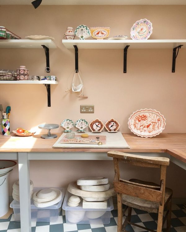
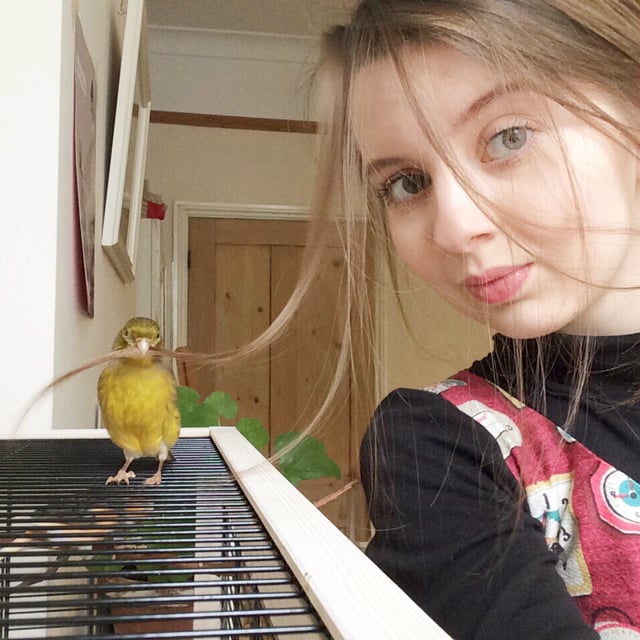
On any given day, you’re likely to find British illustrator and ceramicist Polly Fern in her studio happily painting with her canaries Olive and Morris nearby.


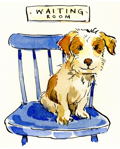
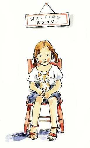
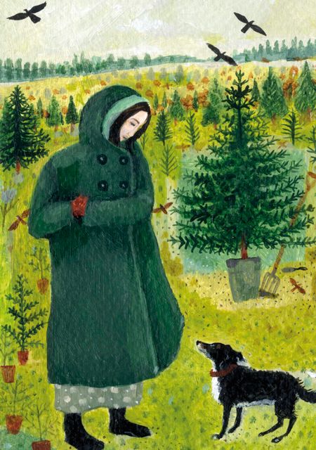
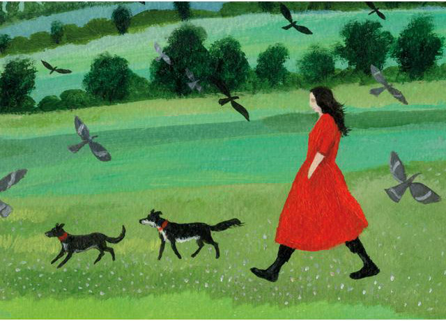
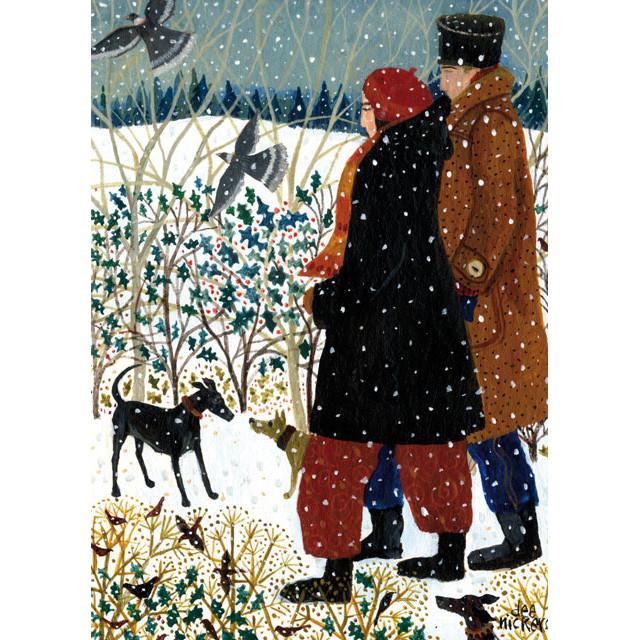
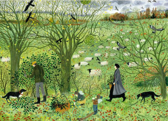
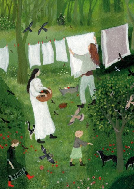
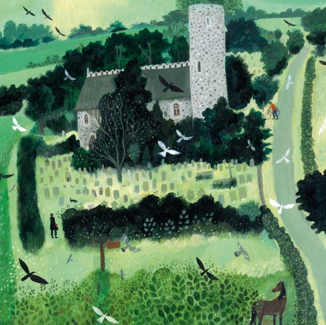
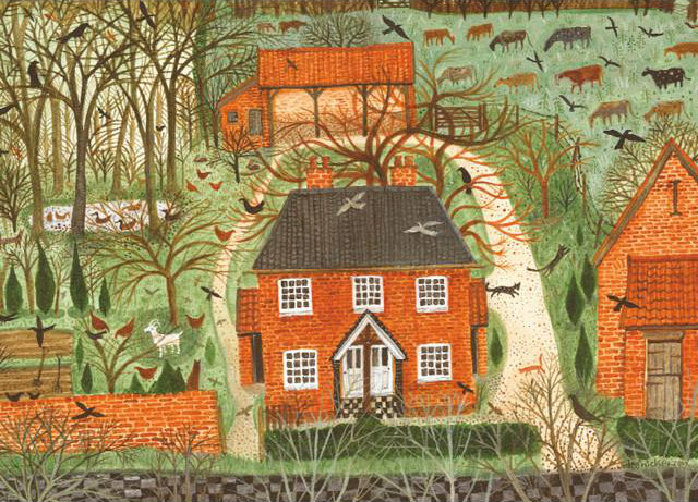
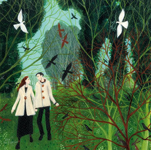
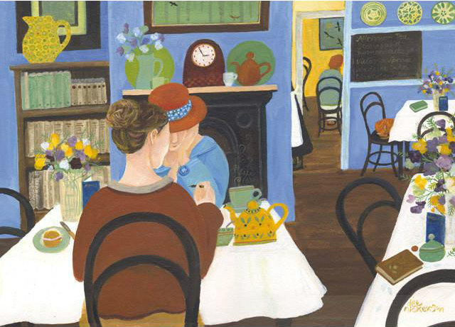
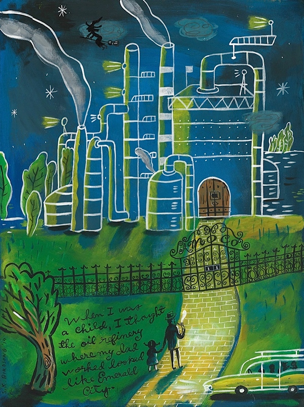
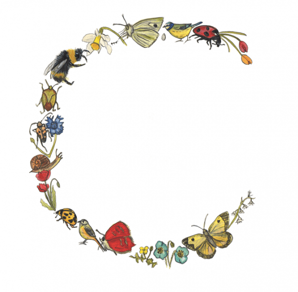
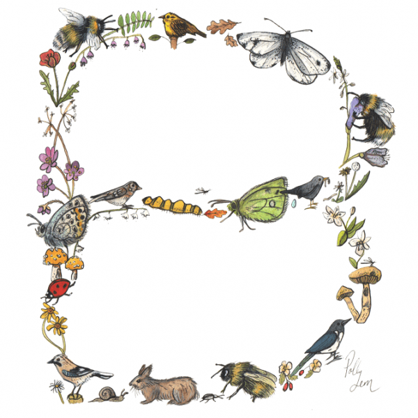
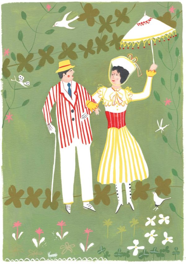
Her birdie friends appear in her work, along with other domestic animals, garden flora, and winsome figures from halcyon days, who seem to thrive on the simple, everyday pleasures of rural life.


Polly grew up in the Norfolk countryside, but now lives in Norwich City, which is the most complete medieval city in the United Kingdom. She earned her BA in First Class Illustration in 2015 from Norwich University of the Arts.


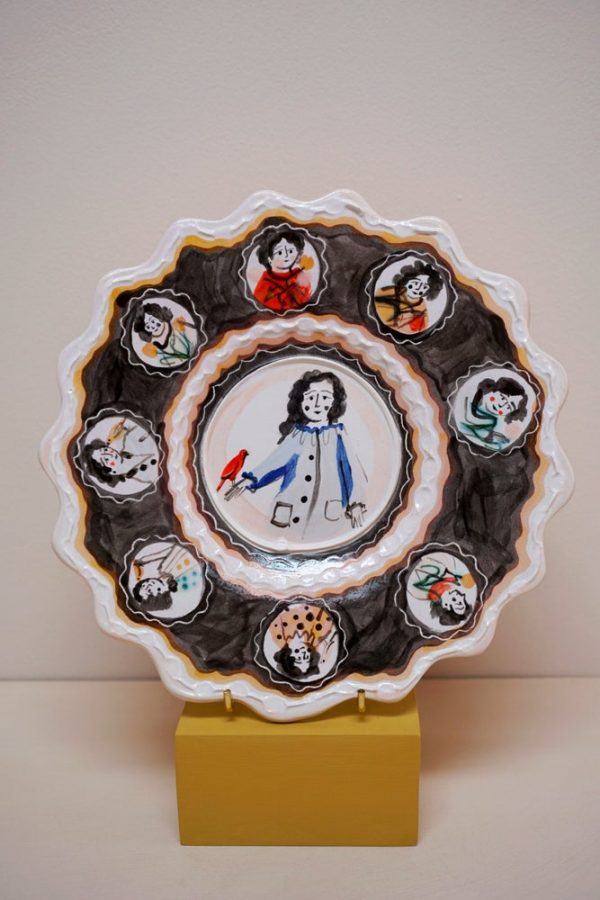
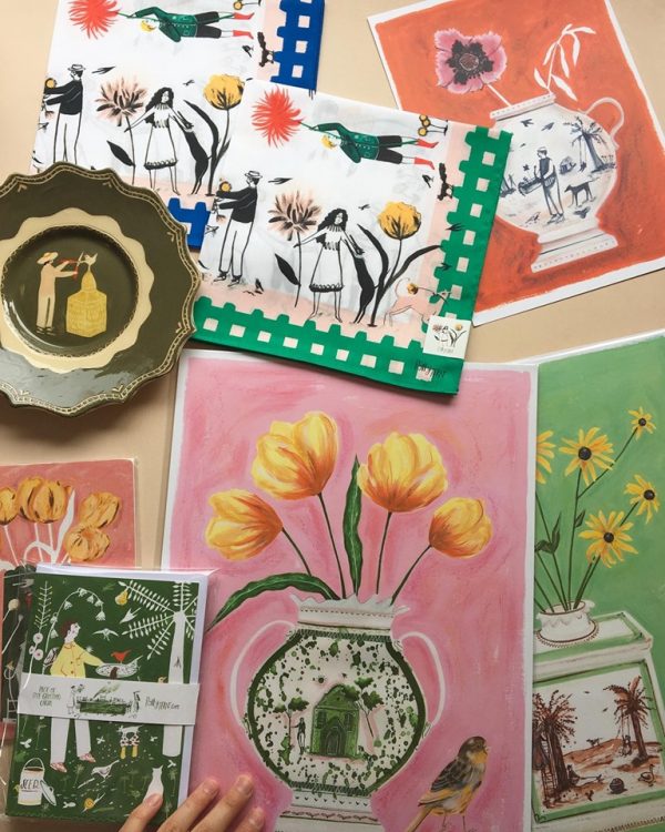
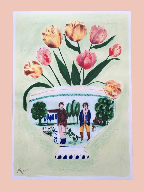
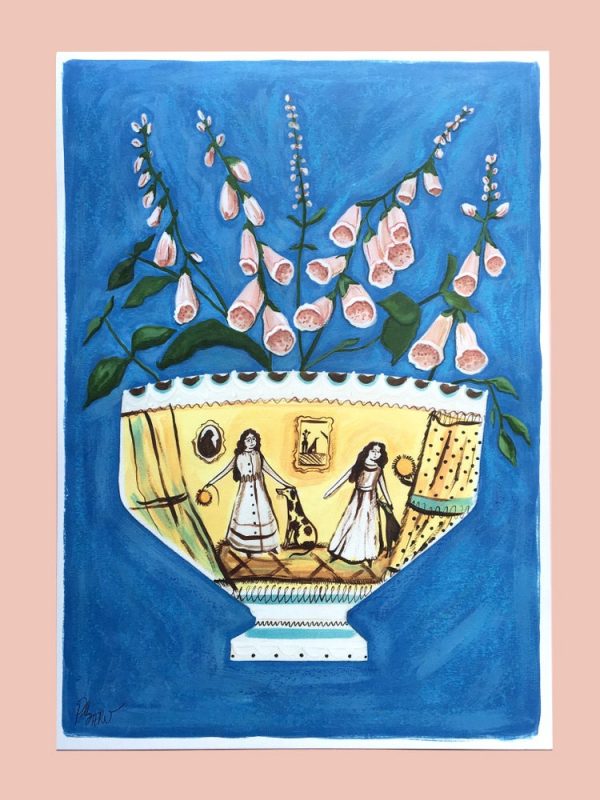
Her charming folkloric style is detailed and delicate, inspired by history, local places and childhood stories. Her ceramic vases and platters, which are modern takes on traditional shapes, are all handmade and bisque fired. Her vessels are dipped in a tin glaze before the designs are painted on with oxides and pigments.

I hand paint all of my decoration. I paper-cut a lot of my illustrations and then use the paper resist technique on raw ceramic, painting upon them with slip and peeling away the paper, then working back into the resist shapes with glazes and oxide details. It’s quite a labour-intensive process; with each piece I make taking a lot of time. But the process is important to my work and I wouldn’t enjoy it as much if it were straightforward.


Polly likes browsing antique shops and museums, wandering around market towns, and discovering gardens and buildings with a rich history of craft. Some of her ceramic pieces do look like things you’d find in a museum, and it’s fun to study the scenes she’s painted to ponder the stories taking place.


Her clients include Marks & Spencer, the MET Museum (NYC), Osaji, Pavilion Books, CARAMEL London, Home and Antiques Magazine, and Little Thing magazine. She’s also designed a line of products for Tonkachi Japan, which includes tumblers, handkerchiefs, notebooks, and iPhone cases. Her work has been displayed in various world-renowned international galleries.


In addition to her illustration work, Polly enjoys cooking and dressmaking, and hopes to someday design fabrics and create children’s books. She’d also love to have her own aviary. Her favorite foods include chocolate, figs, and pasta.


Find out more at Polly’s Official Website, Instagram, and Facebook Page. You can purchase prints, greeting cards, brooches, ceramic pieces, and other goodies at her online shop.


Enjoy this short video of Polly painting dogs with canaries Olive and Morris singing in the background:


Copyright © 2019 Jama Rattigan of Jama’s Alphabet Soup. All rights reserved.

cool and quirky: stephanie birdsong


Well of course. How could I not love an artist who paints a 24-hour SOUP restaurant? 🙂

At her blog, California based creative director and illustrator Stephanie Birdsong (cool name, no?) describes her picture this way:

Daisy packs up the kid and the dog and hops in the car to get some extra-delicious soup from Ida’s. It’s just down the lane. I started with a painting in my sketchbook, & added a storefront and, of course, a bear!

You gotta love that she thought to add a bear (Mr Cornelius was especially pleased about that).

Much as I love Ida’s, this wasn’t the first of Stephanie’s gouache and acrylic paintings to catch my eye. It was actually this piece:


It spoke to my inner Brownie (I still have my beanie from when I was six). I like the freckles, the pigtails with a mind of their own, and the general kookiness of the whole thing. It’s called “Kicked out of the Brownies.” 😀


Stephanie’s fun and irreverent style reminds me of Maira Kalman and Jessie Hartland — sophisticated and childlike at the same time. Since there’s usually a surprising detail or two; you can’t help but look closer. Both Maira and Jessie have illustrated children’s books — I hope someday Stephanie will too. Long live the quirky!


Continue reading

amy rice’s mixed media art: wistful, whimsical and nostalgic

Recently stumbled upon the work of Minneapolis-based mixed media artist Amy Rice, and was drawn to her unique style right away. Since she grew up on a dairy farm in the Midwest, it’s no surprise that she favors natural and pastoral themes.

Though she took many art history courses in college, she didn’t receive any formal art training, having majored in sociology and women’s studies. Being a self taught artist has worked in her favor, as she has never felt constrained by any hard and fast rules or the need to adhere to convention.

She achieves her trademark style with non-traditional printmaking methods, including hand cut stencils and a Japanese screen printing toy called a Gocco. She uses spray paint, acrylics, gouache, and ink to print on a variety of surfaces, including wood, fabric, and antique papers (handwritten love letters, envelopes, music sheets, maps, journal pages), and “is most satisfied when I can make a tangible or visceral connection between the materials used and the image rendered.”

Continue reading